


Share this article
Learn from the brightest minds how to predictably and efficiently grow revenue.
Related Content
Bringing Revenue Intelligence to Salesforce
Have you ever tried to build furniture without the instructions? You can follow your gut and may end up with a completed project – but there will always be a few screws left over. Your sales team can feel like that too. Their CRM may show them the parts – but without the data and…
The Ultimate Forecast Submission Tool for Managers
New view for managers to review their teams pipeline, inspect their opportunities and change the forecast status.
Deal Qualification Guide Scoring
Give each of the 8 MEDDPICC® criteria a score from 1-10, helping reps to define what success looks like - so they can plan to close it.

See how forecast submissions have changed with Ebsta Waterfall
Do you struggle to understand why your team’s forecast submissions change week by week?
Finding out how and why your team’s forecast submissions change every week is a hassle. It takes hours and involves going through your CRM and possibly multiple excel spreadsheets – often to little avail.
Now you can see how your forecast is trending over time in seconds with our latest release, the Waterfall Chart. See how your team’s commit and upside forecasts have changed, and more importantly – understand which opportunities drove this change.
Armed with this insight, sales leaders can identify why forecasts are trending up or down, and understand at an individual opportunity level also. Feedback can then be passed down to managers and coaching delivered to reps to improve the accuracy of their forecast commits.

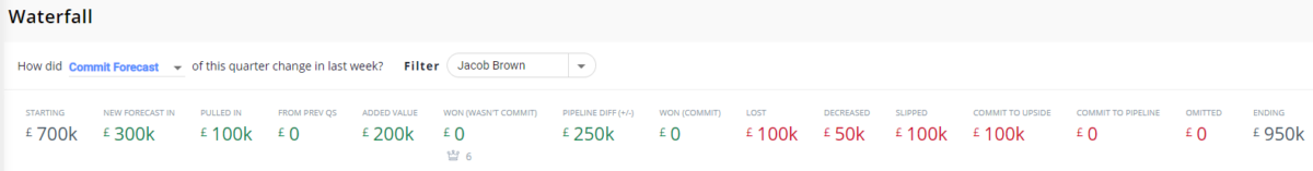
On the left hand side you can see the initial submission by the team or user and on the right hand side is their latest submission. In between these figures you can find out what happened to their submission during the week and identify any areas that they might need support with.
To explore specific opportunities simply select a metric and the Opportunity sidebar will be updated with all of the opportunities in that category.
For example, you may want to see how your forecast submission has changed in the last week. Previously this would have involved taking a daily snapshot of your team and individual rep submissions in your CRM. This data would then need to be transferred to a spreadsheet to begin making sense of it. Now, using Ebsta’s Waterfall Chart you can see at a glance what changed within the Ebsta console and explore the specific opportunities that changed – all within the console.
You will be able to view the metrics for all forecast submissions from week to week including:
- Starting Forecast Submission – initial forecast submission.
- New Forecast in – new opportunities created during the week with the forecast category set to commit.
- Pulled In – An opportunity pulled in from a future quarter with a commit forecast
- Added Value – Increased value for deals.
- Pipeline Difference – The difference between the submit and pipeline difference from the start of the week until the end.
- Lost – Deals that were lost in the last week.
- Decreased Value – Deals that have decreased in value.
- Slipped – commit deals have been pushed to the future quarter.
- Forecast Out – Deals that were in Commit but have now been pushed to best case or pipeline. Broken down by commit to upside, commit to pipeline and omitted in the metrics table.
- Ending Forecast Submission – Latest forecast submission.
The Waterfall Chart is an invaluable tool to understand how forecast submissions have changed and give you visibility you need to plan for the future.
The Ebsta Waterfall is available in Salesforce & HubSpot, to customers with the following subscriptions today;
- Professional
- Ultimate
To begin understanding the changes in your forecast submissions (if you are not already using Ebsta) then get connected today.